Case study · Flipkart · E-commerce · 2014
Flipkart
A product page that is fair to sellers and clear to shoppers.
Design in motion
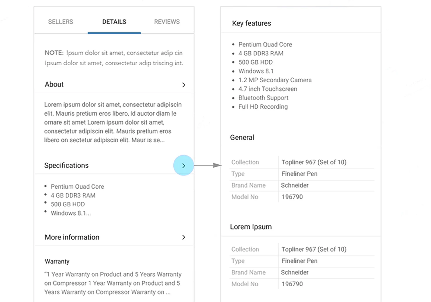
Revealed on demand.
Product page interactions.

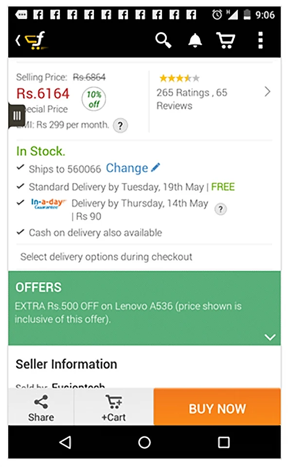
Before / after
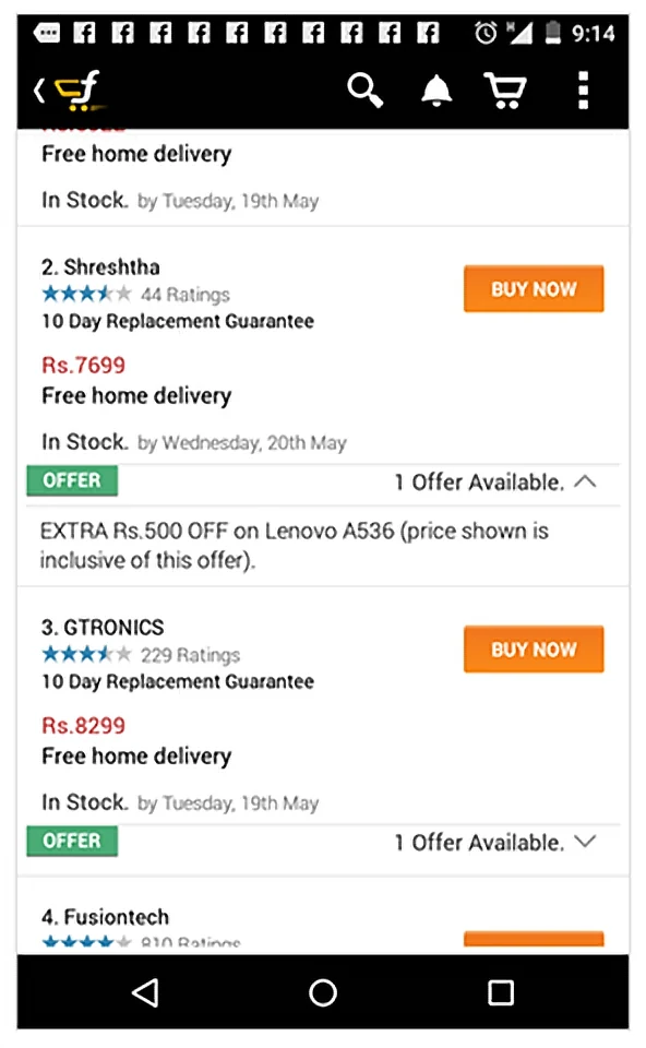
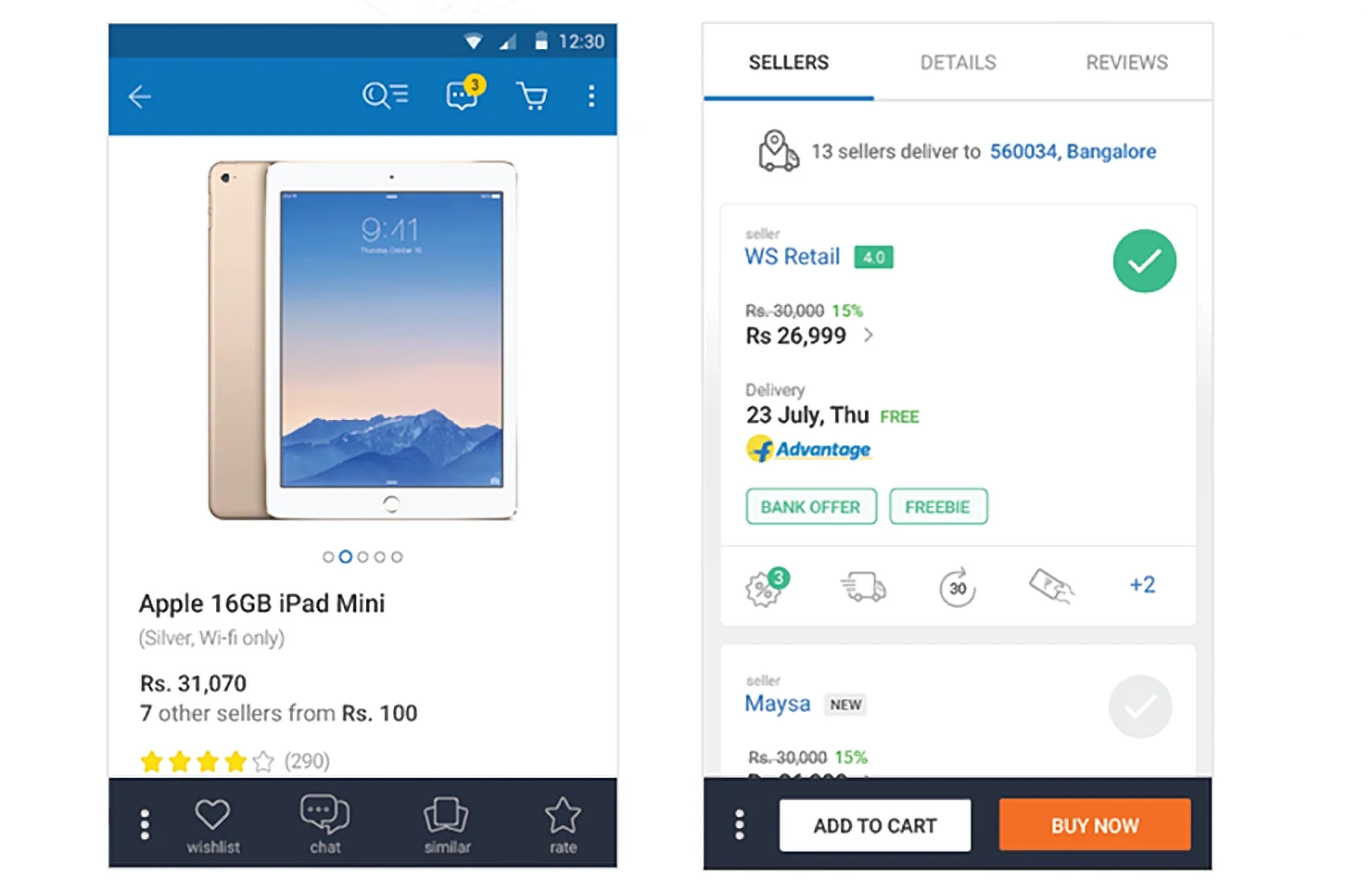
Sellers, seen.
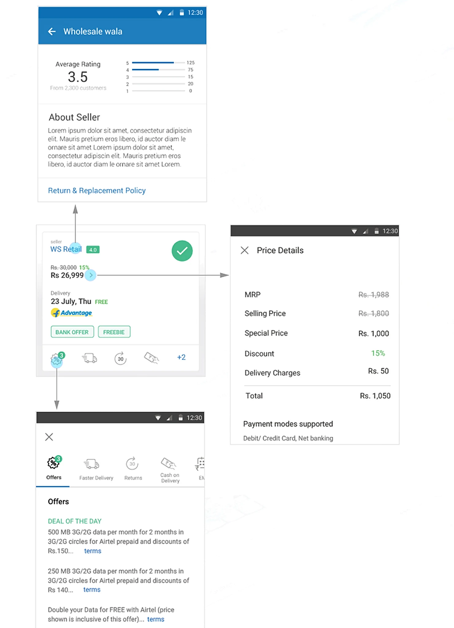
Three solutions
Where the design does the work.
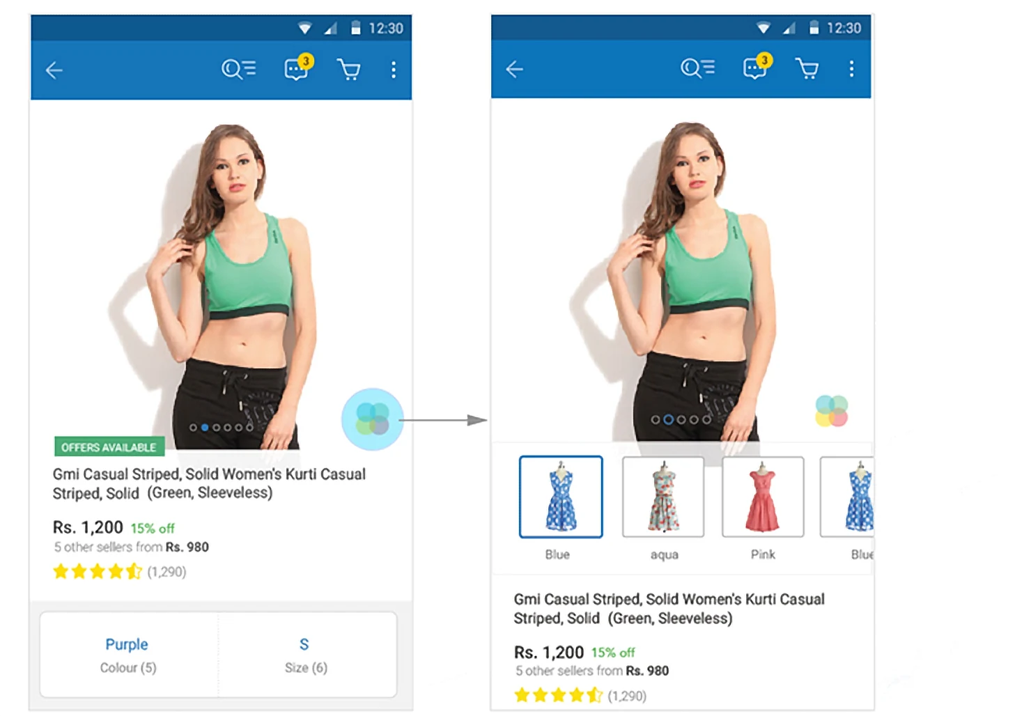
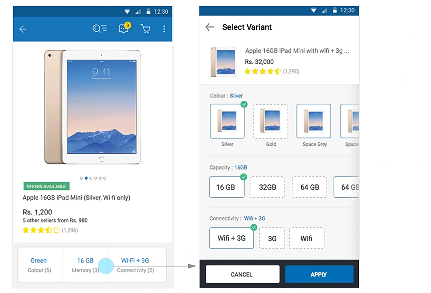
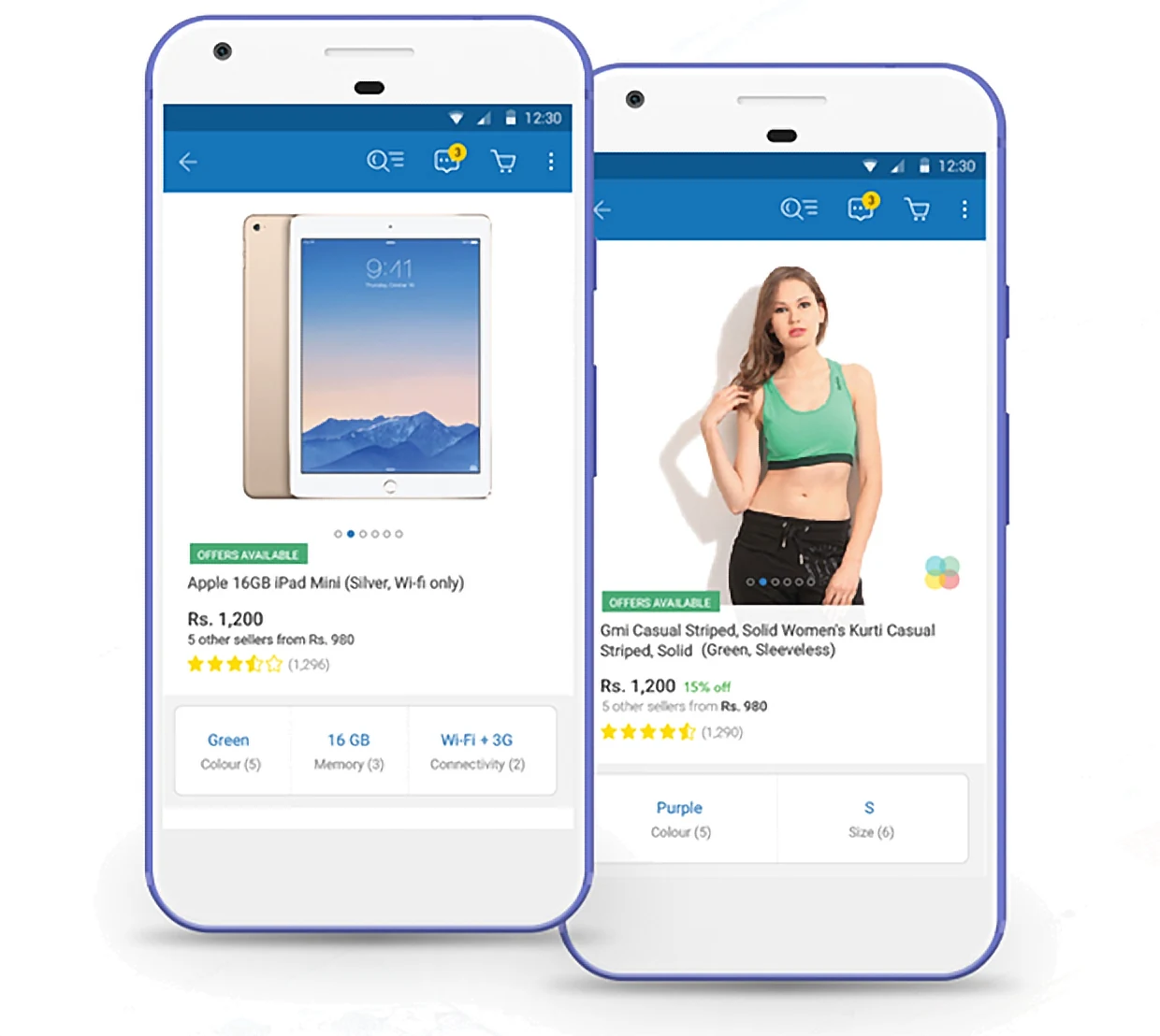
01 · SWATCHESColour and size, together.The two choices that matter, in one selector.
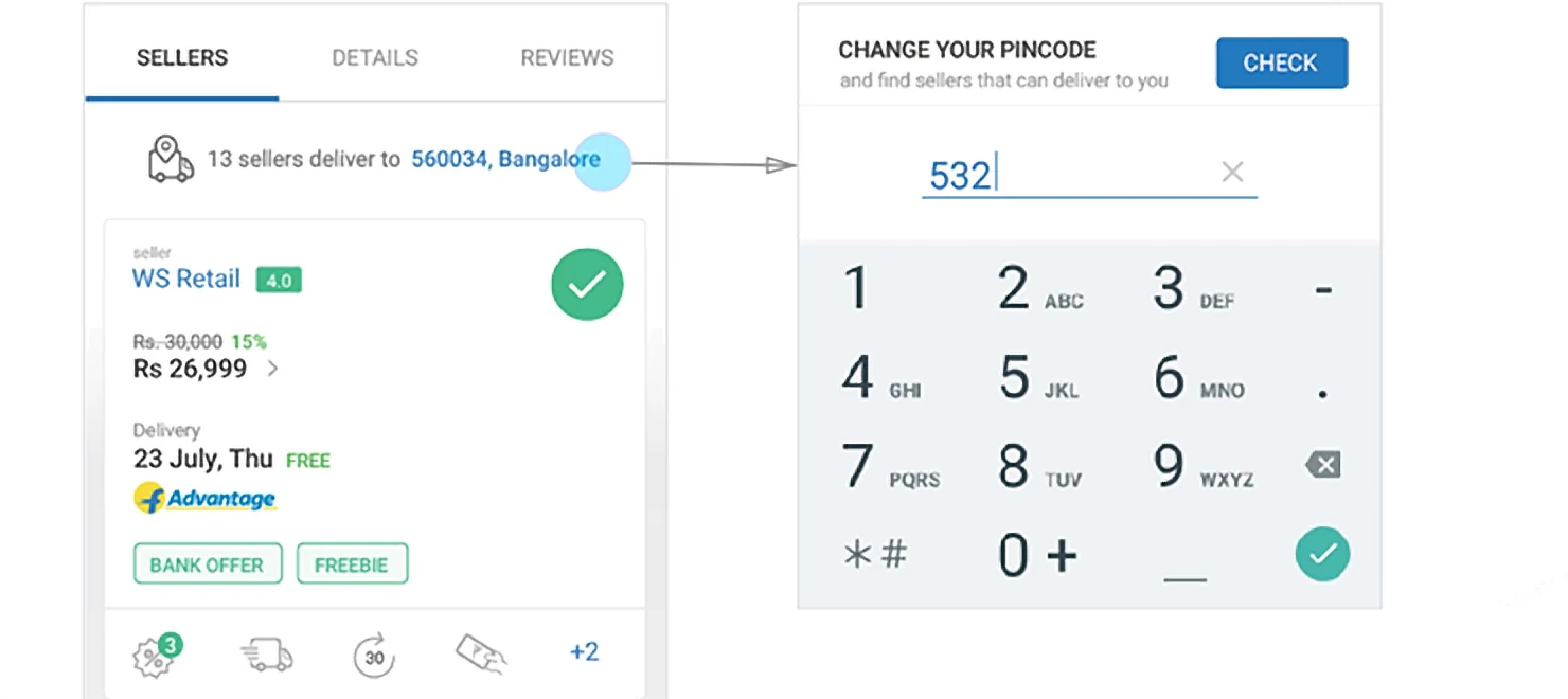
02 · DELIVERYOnly sellers who deliver to you.Change the pincode or the variant.
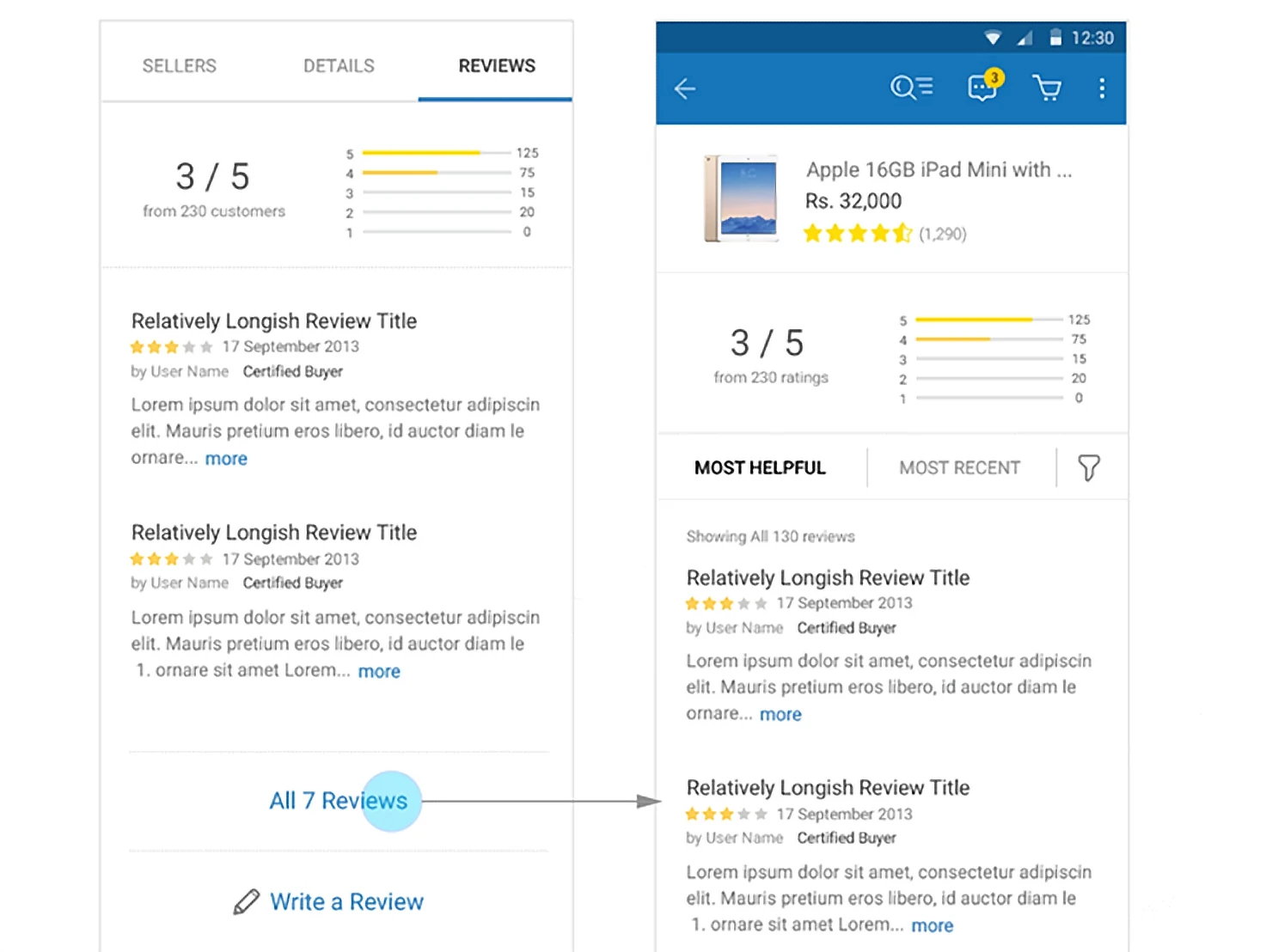
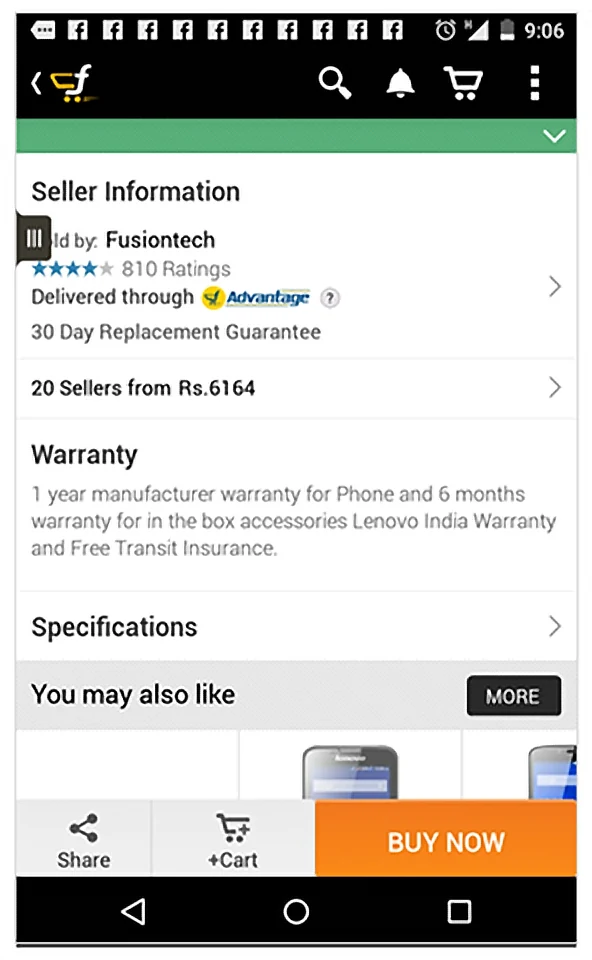
03 · REVIEWSProduct and seller, apart.Separate reviews, for fairness.
The screens
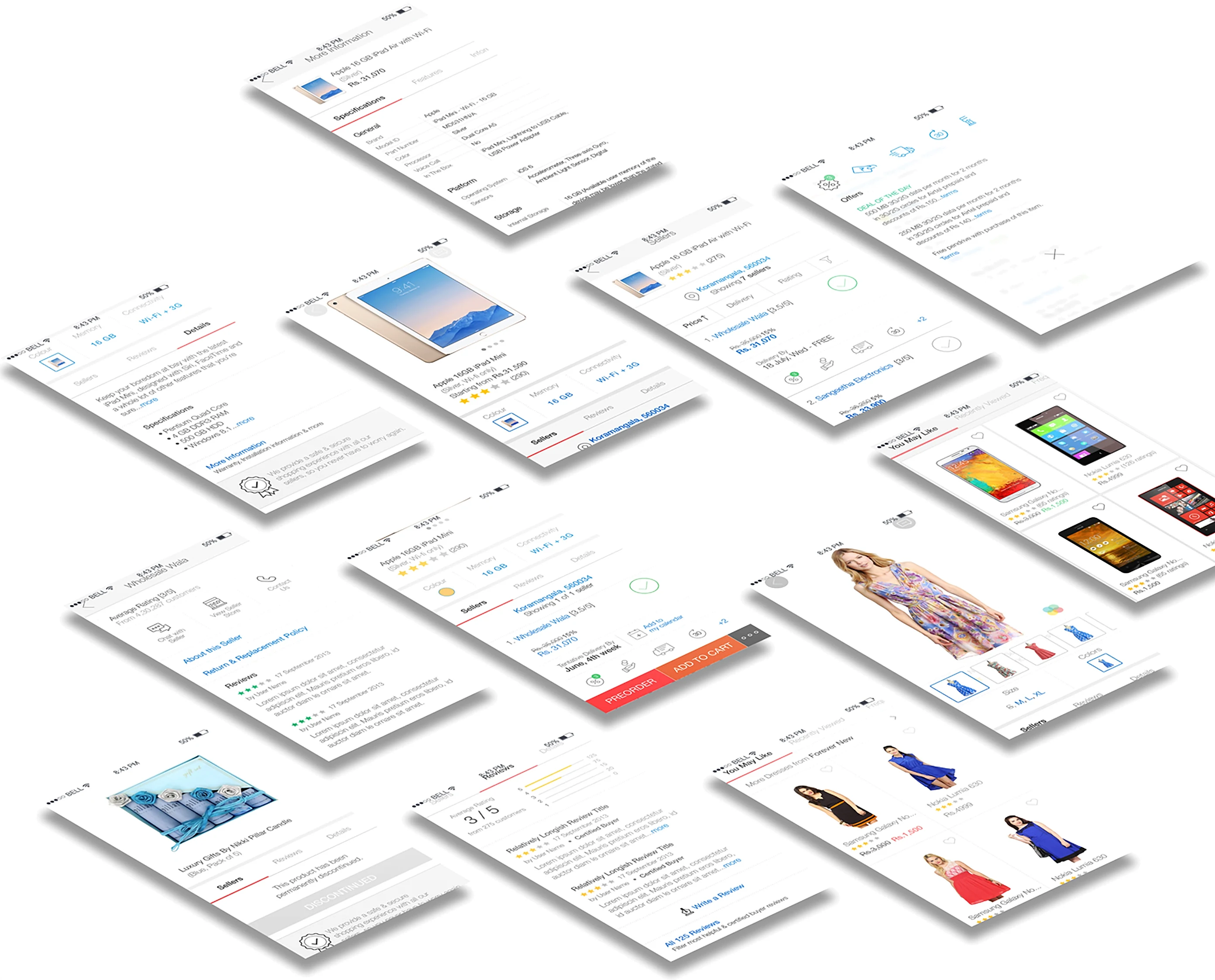
The path to purchase.
Pick a screen.
01 / 07Lifestyle swatchesColour and size in one selector.
Under the hood
Evidence before pixels.