Case study · Flipkart · e-Commerce · 2014

Redesigning Flipkart’s product page
A product page that gives marketplace sellers fair visibility, and helps shoppers choose and buy with confidence.
01 · Brief
Two things to keep in mind
Enhance Flipkart’s marketplace model, giving sellers more visibility.Goal one · Sellers
Help users choose and buy products more easily and confidently.Goal two · Shoppers
02 · Problems
What was wrong with the old page
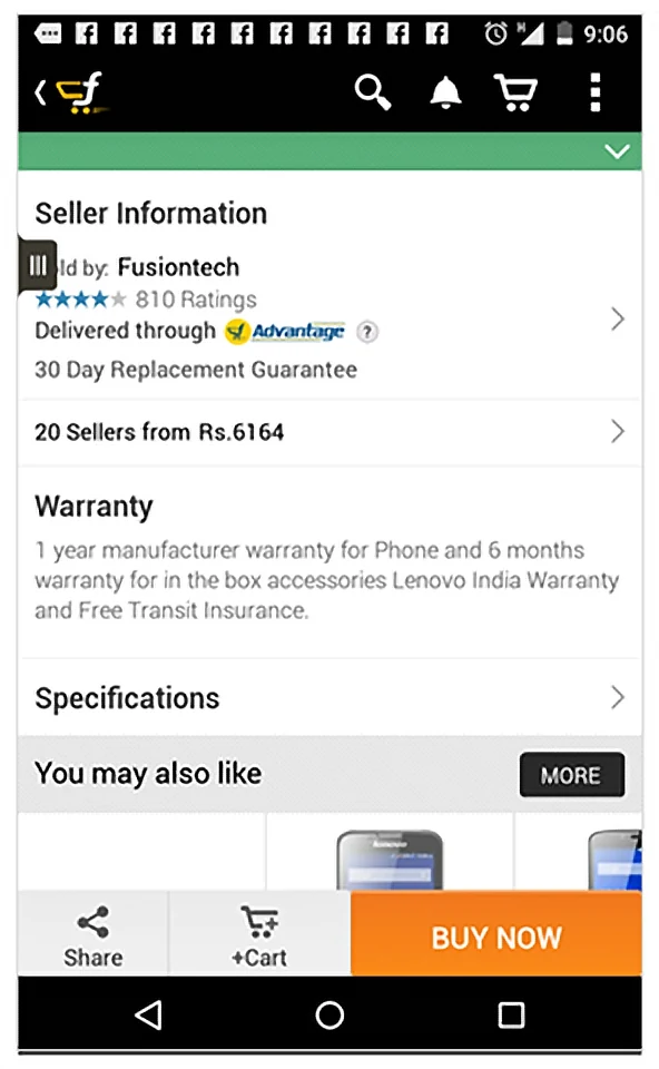
Sellers were invisible
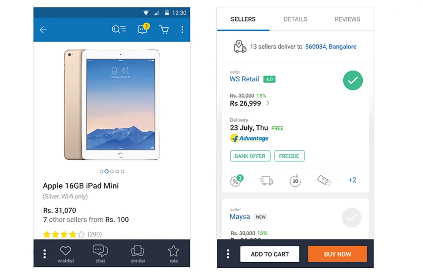
Users didn’t explore who was selling the product.
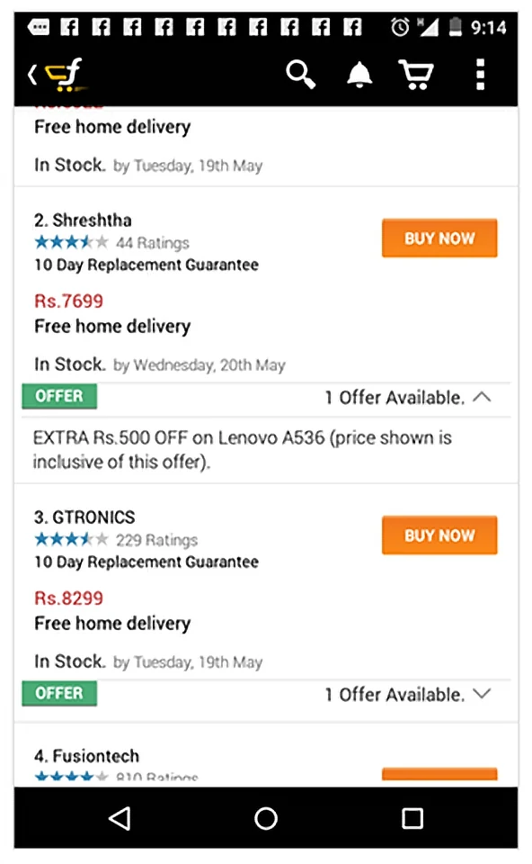
Users overpaid
Most bought from the preferred seller, unaware of a cheaper one.
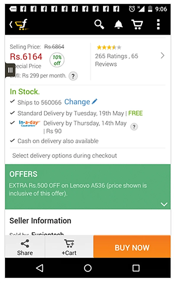
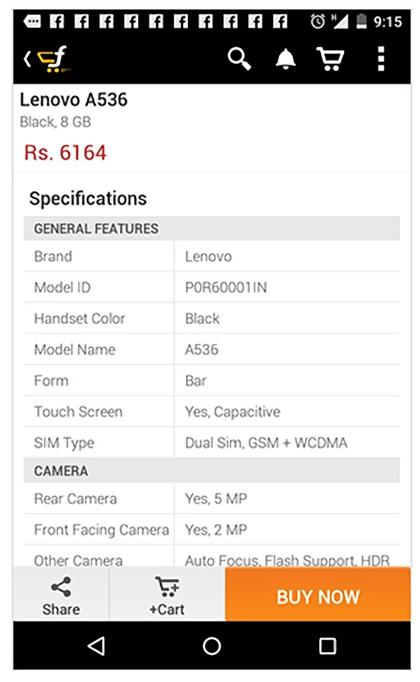
Poorly structured
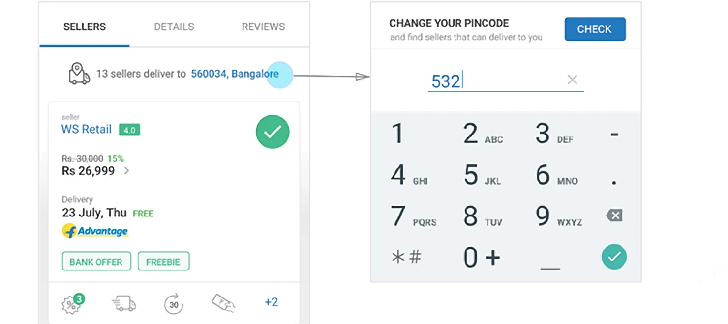
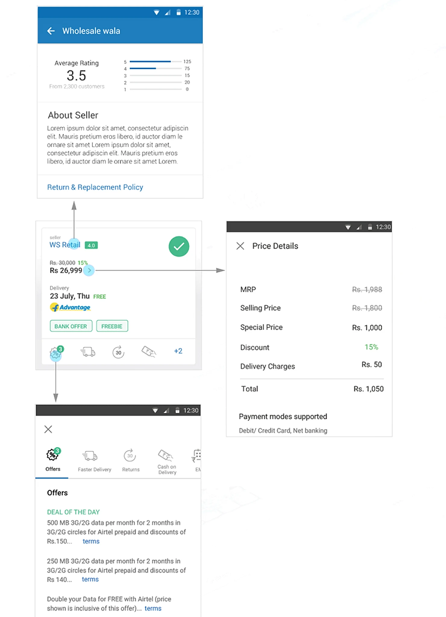
Delivery and offers are seller-specific, but weren’t shown with the seller.
Overwhelming
Hierarchy needed work — let users skim, not drown.
03 · Business needs
What the new page had to do
Marketplace fairness
Users pick the best seller by price, reviews, offers and SLA.
Delivery and variants
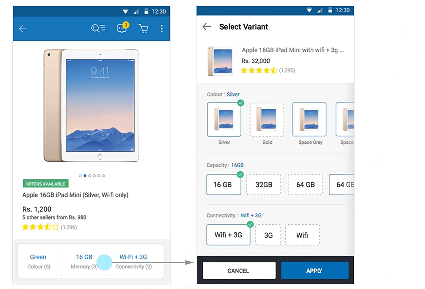
Each variant is a product; sellers differ in price and delivery time.
Scalable design
Room for related products, combos and complete-the-look.
Intuitively navigable
A rich app: gestures, animation, fewer taps than the m-site.
04 · User experience
A shopper’s path to purchase
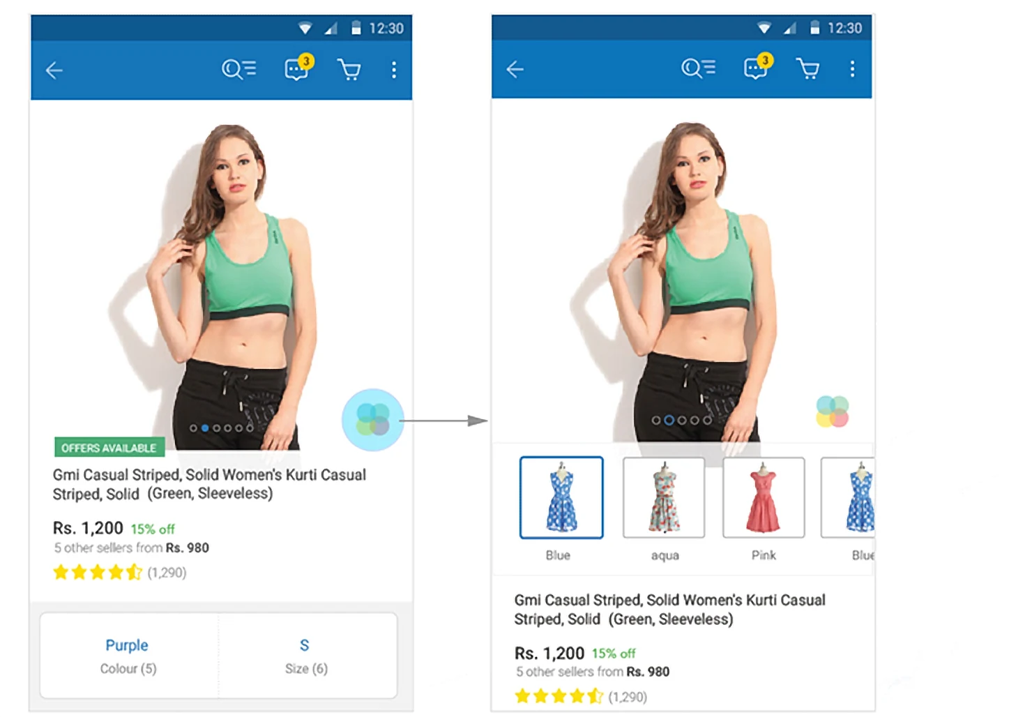
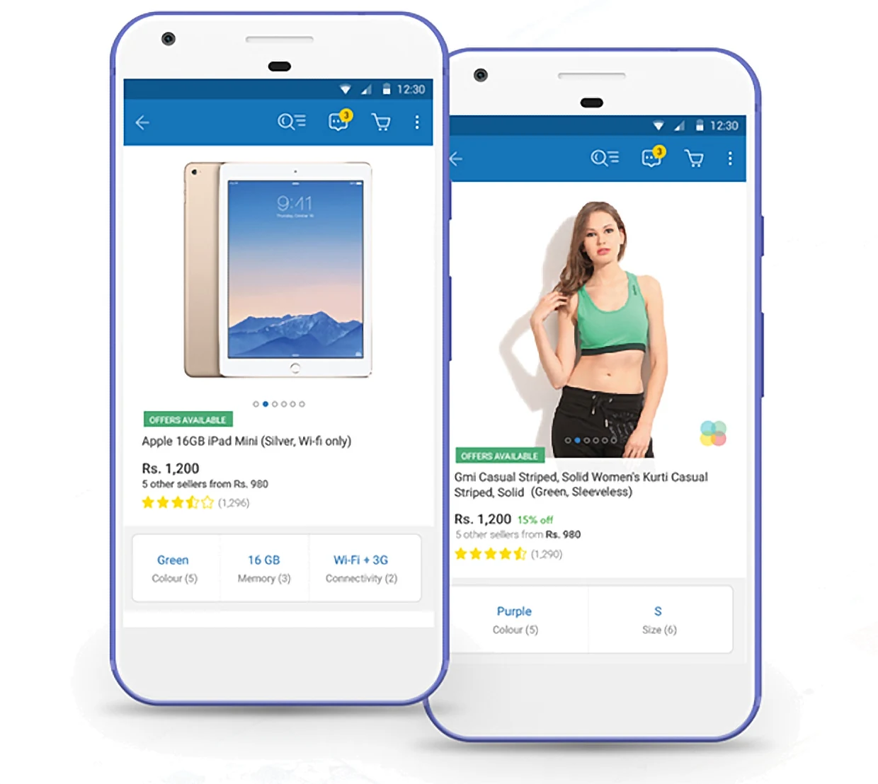
Swatches — lifestyle
Colour and size — the two criteria that matter most — in one selector.
05 · Interaction design
Information revealed on demand
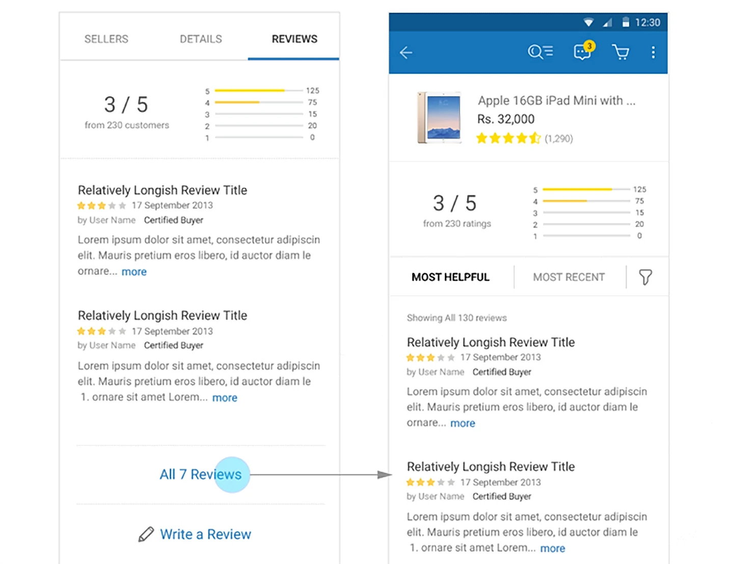
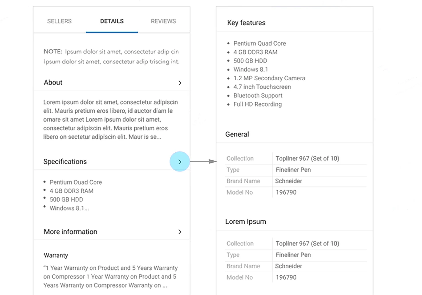
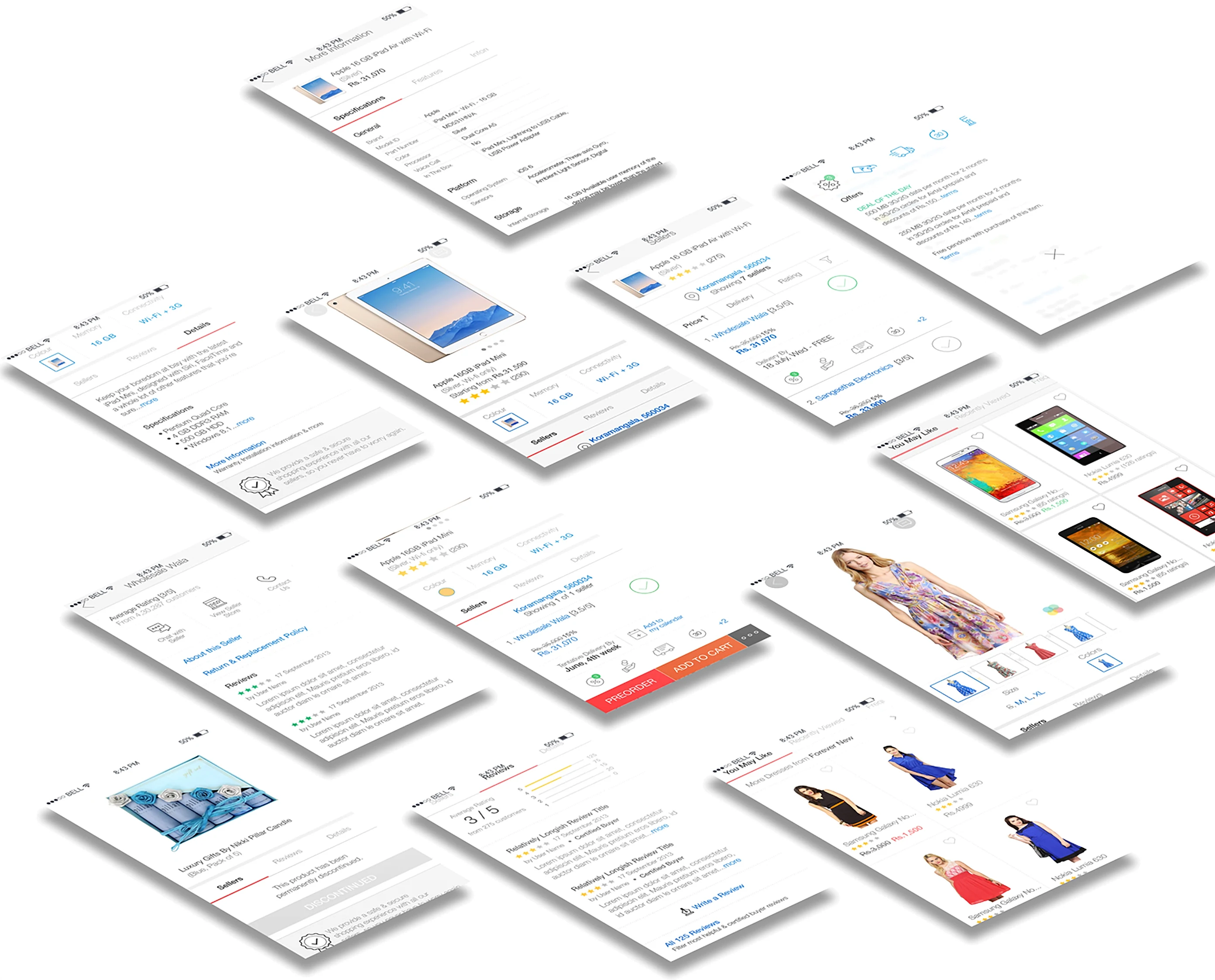
Contextual interaction: information appears when asked for, and there’s more to discover the deeper you go.

iOS adaptation
Thank you
Flipkart product page redesign · UX/UI Designer · 2014