Sarthak Batra
About Me
Go to Top
Menu
Scan & Go

Self checkout app for in-store shopping experience designed for a wholesale brand  -

Sam's Club

Mexico, A

Walmart

Company

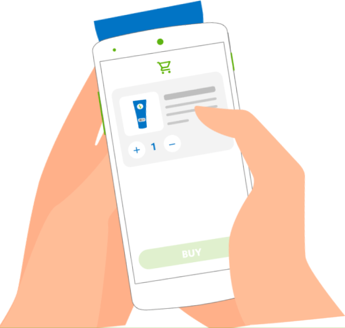
Two hands holding a phone that shows the Scan & Go cart: a product thumbnail, a quantity stepper set to 1, and a Buy button

Problem Statement

Sam’s Club, Mexico wanted to improve their in-store shopping experience as there were huge queues at the checkout counters with long wait times.

Business Objectives:

1. As a business, Sam’s Club wants to improve their shopping experience by tackling traffic in the stores as less rush in the store equals to more business. 2. As a business, The stores would want people to discover Sam’s Club mobile app and order online. 3. As a business, Sam’s Club wants their users to adapt to digitisation by enabling their digital wallet and transact.

Success Metrics:

User experience metrics: Reducing time to checkout by 50% Business metrics: Increased sales by 10% Overall long term cost to business reduced by hiring lesser staff

Storyboard

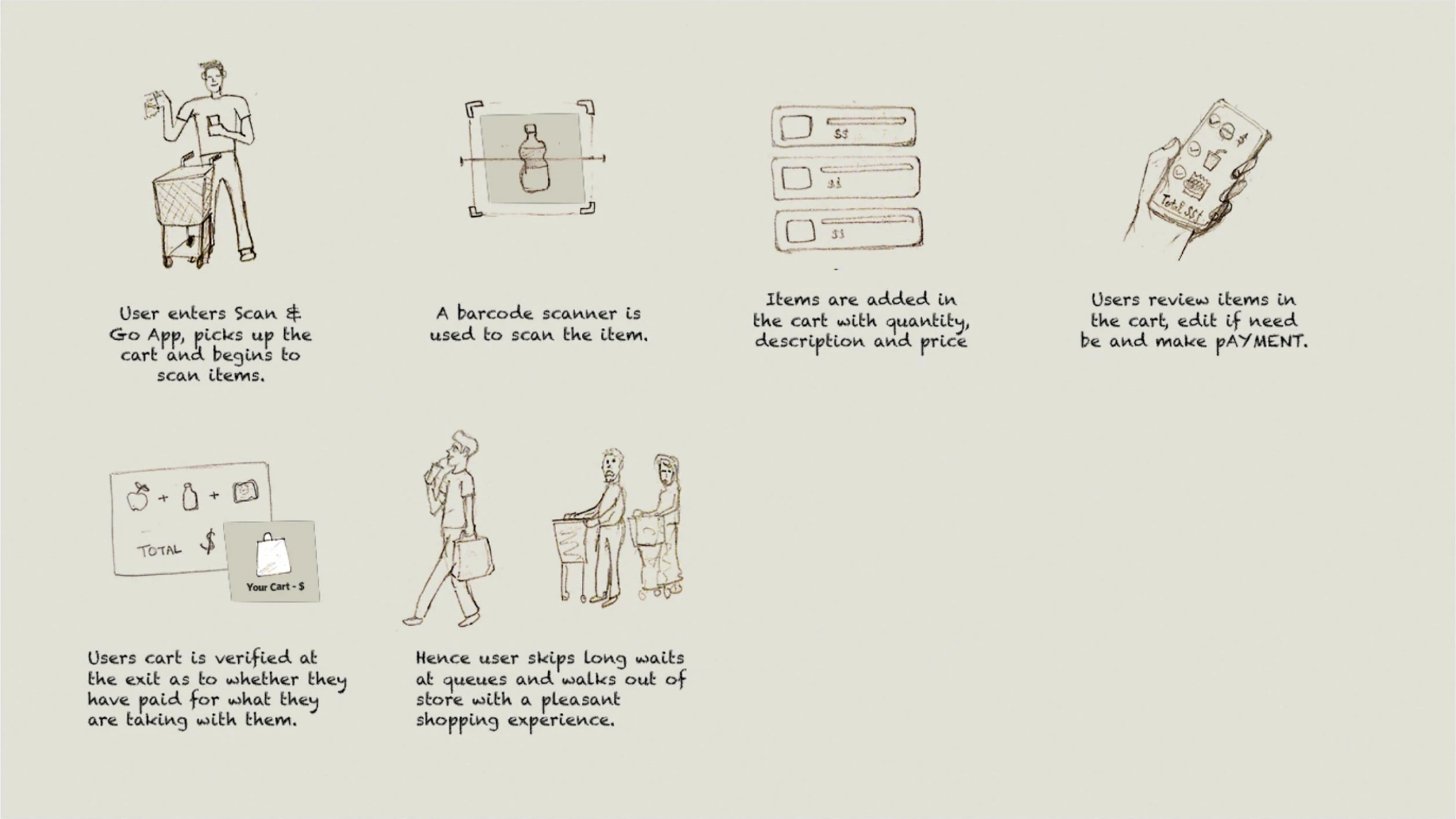
Six hand-drawn storyboard panels: a shopper takes a cart and starts scanning, a barcode scanner reads an item, items land in the cart with quantity and price, the shopper reviews the cart and pays, the cart is verified at the exit, and the shopper walks out past the queues
Walkthrough still titled “Scan & Go – Add items to cart flow”: a slide headed “Cross-sell, up-sell products by offer discovery” listing how offers surface on cart items and the two ways to pay, beside a phone showing the Scan & Go cart with two items and a $2,300 total

Design Process

Here’s how I went about coming up with the final solution.

Business Alignment

Sam’s Club stores have a huge foot-fall and loyal customers come to buy from the stores on a weekly or bi-weekly basis to stock up their goods for their households or for their businesses.

Sam’s Club needed a solution to attend to the existing customer base and also scale to the rapidly growing customers who sign up for the loyalty programs.

Research

Both Qualitative and Quantitative research was conducted for the stores that was essential to design a system of shopping that would help Sam’s Club sustain its store operations.

Quantitative Research objectives:

1.  Know about the demographics, behaviour, mindset of our target audience in context of shopping

and purchase decisions.

2.  Time spend of average user at the checkout counters and overall store.

3. Identify who would be the user base who would adopt to the app first and

what does it take to onboard everyone.

Key Insights from Quantitative study

97%

customer come to the store to shop as its a family activity.

3%

trust online channel to make a purchase and get things delivered

40%

Customers are hoteliers and restuarant owners who purchase groceries from Sam’s club.

50-50

ratio of customers going for cash vs card payments, also cards have a 2% service fee.

75-25

75% customers are businesses loyal since an avg of 3 years and 25% family with an average of 4 members per family.

60%

have facebook, 12% Twitter, 20% youtube and 1 of 5 have Costco membership.

Qualitative Research objectives:

1.  Find out shopping behavior of customers at Sam’s Club across categories.

2.  What are the current issues do they face while finding items till checkout.

3. Identify who would be the user base who would adopt to the app first and

what does it take to onboard everyone.

Key Insights from Qualitative study

Personal Hygeine

A behavior was observed that people do not like to use physical scanners in supermarkets as they were touched by other people and may be unhygeinic.

Avoid self checkouts

Self checkouts is a tidious system where users have to scan all items and pay by themselves. Non-tech savvy people are hesitent in using as its complex and percieve it as time consuming.

Distrust in Online payment

Mexico is majorly a cash dominant market, Customers transact in cash and don’t trust credit card or debit card in fear of fraudulent activity. Some use credit to avail special discounts.

Concept stage

At this stage, I used user personas and created journey maps to empathize with the target users based on which wireframes for the flow can be build.

Personas

Young couple

Purchase Attitude

Lifestyle

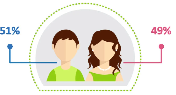
Persona illustration of a young couple inside a dotted green arc, split 51% male and 49% female

Traits & demographics

- 36 - 65 yrs - 13% have babies - 51% of children have an average age of 20 years old - 62% have facebook, 13% twitter, 44% google+, - 26% youtube

Enjoy shopping

“Shopping is a family entertainment, I normally spend more money that I should.”

Good selection

“I like going to stores where I can find everything I need.”

Proven service

“I prefer stores with good service” “I prefer shopping at stores that are recommend by a friend or acquaintance”

Time is relevant

“It is better to buy larger presentations so you don´t have to go so many times to the stores.”

Responsible & Respectful

“I am responsible of my own destiny” “It is very important to respect partners/ family and friends”

New experiences, new people

“I like experiencing new things” “I am always informed about social events”

Stand out

“I consider myself an extroverted/ uninhibited person”

Hotels and restuarant chains

Purchase Attitude

Lifestyle

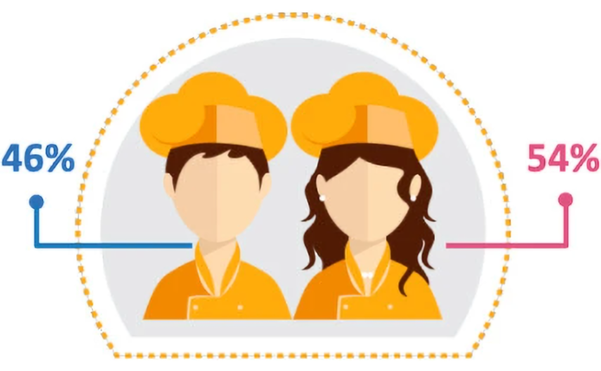
Persona illustration of two uniformed hospitality workers inside a dotted orange arc, split 46% male and 54% female

Traits & demographics

- 25-35 yrs old - Avg of 11 employees - Kids average age is 19 years old - 1 out of 3 have a Costco membership - 69% have Facebook, 15% twitter, 37% google+, 20% youtube

Planned / organised purchase

“I usually make a list of all products and services I need”

Brand oriented

“It is worthy to pay more for well-known brands”

Service is the key

“I always search for places that give me a preferential /special treatment”

Whim happens

“I normally spend more money that I should”

Updated

“I am aware of what is up to date and what is not” “I am always searching for cutting edge technology” “I love having big screen/ TVs at business”

Extroverted & Social

“I consider myself an extroverted/ uninhibited person” “I spend time with my friend at clubs, bars or home”

User task flows

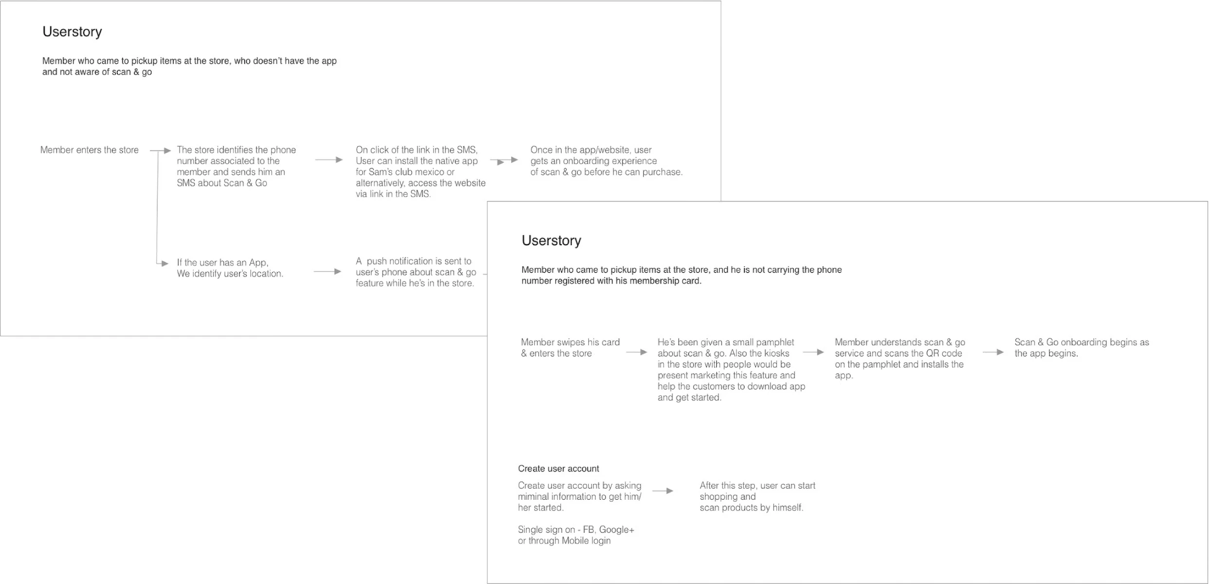
Two overlapping userstory boards. The first follows a member with no app: entering the store, being identified by phone number, receiving an SMS link to install the app or open the website, and landing in onboarding. The second follows a member without their registered phone: swiping in, picking up a Scan & Go pamphlet, scanning its QR code, installing the app, then creating an account with minimal information or a single sign-on before shopping

Visual design and interaction

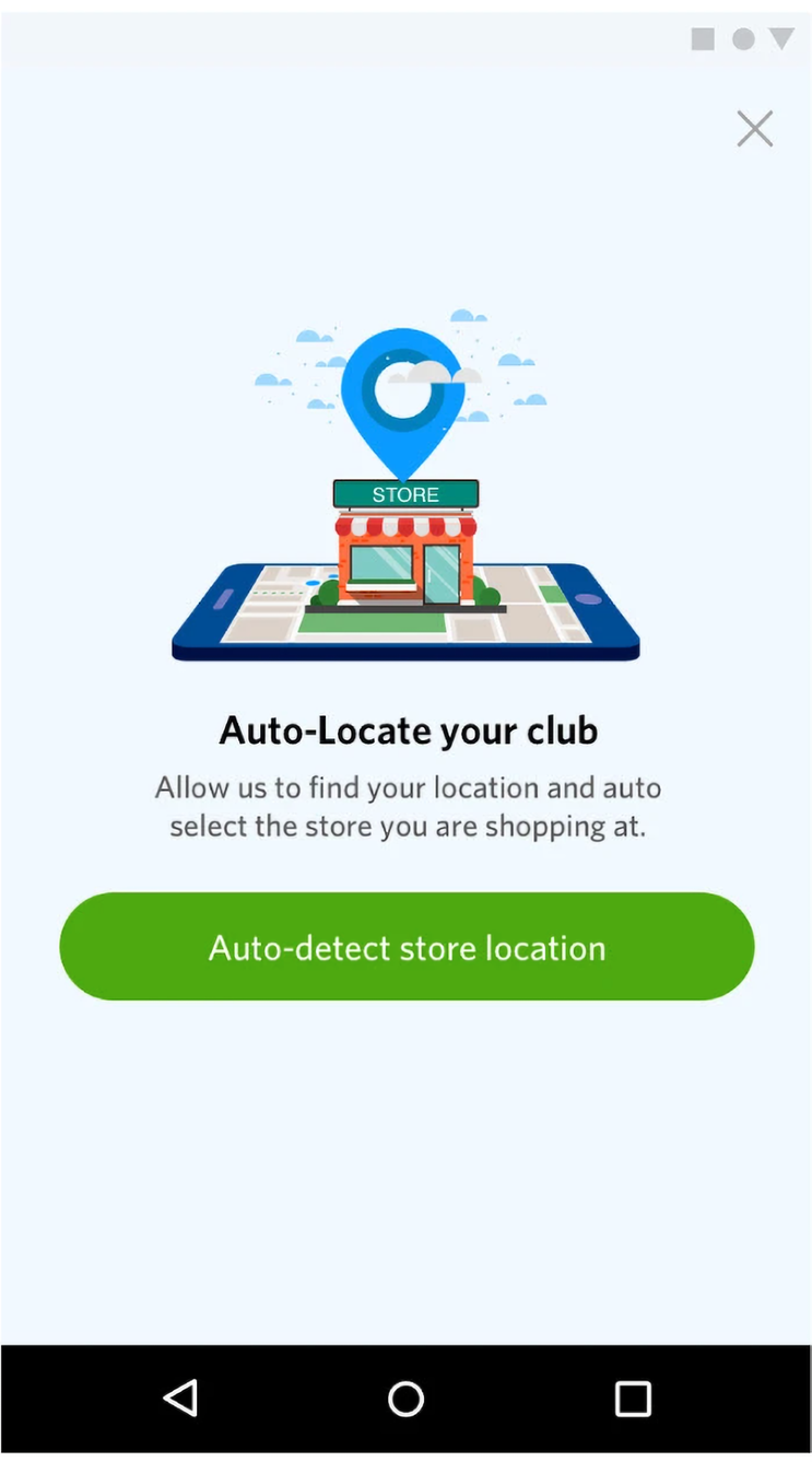
Auto-Locate your club onboarding screen: an illustrated storefront pin on a map above the line “Allow us to find your location and auto select the store you are shopping at” and a green Auto-detect store location button
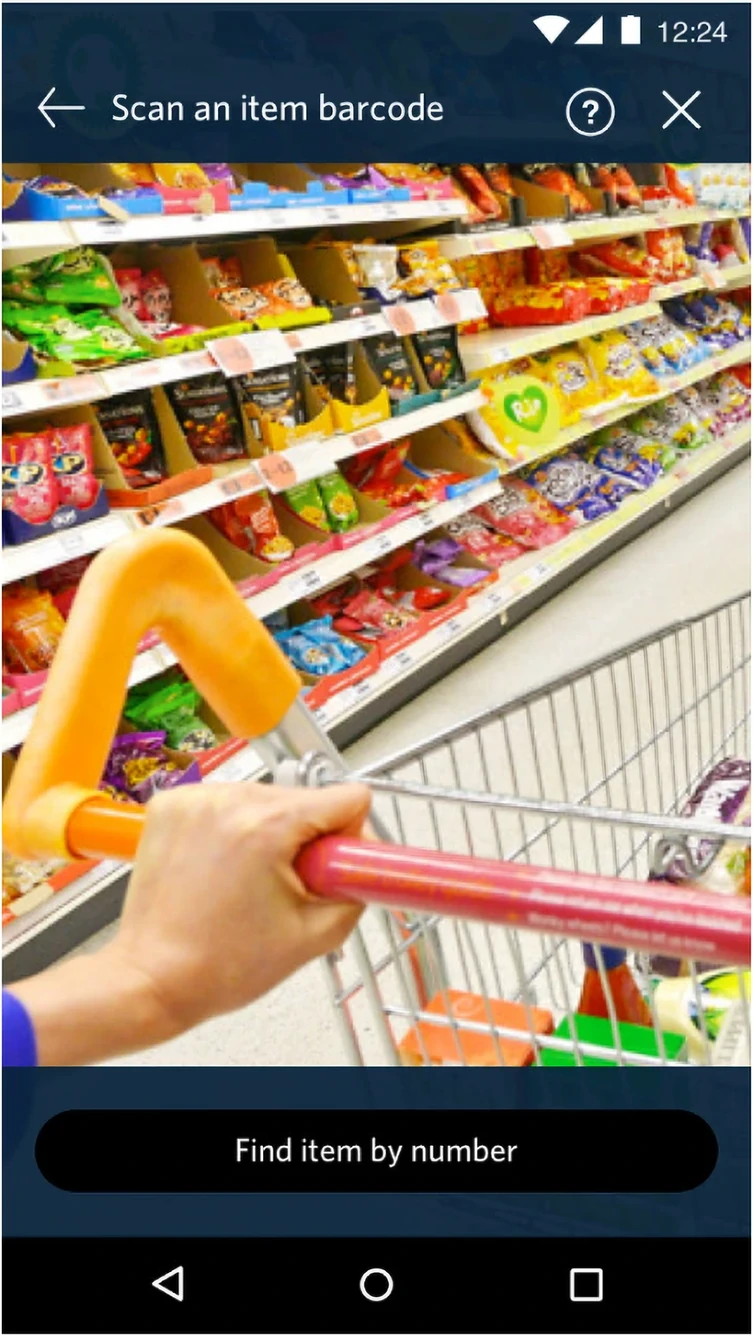
Scan an item barcode screen: the camera viewfinder shows a shopper pushing a cart along a stocked snack aisle, with a Find item by number fallback pinned to the bottom
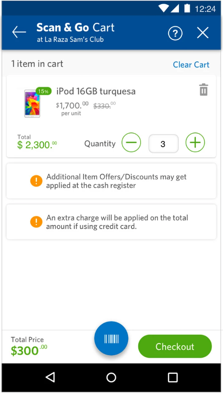
Scan & Go Cart at La Raza Sam's Club: one iPod 16GB turquesa at $1,700 with a 15% badge and a quantity stepper set to 3, two advisory notices about offers and credit-card charges, a $300 total, a barcode button and a green Checkout button

Styleguides

Styleguide was shared in the form of invision documents with flows being annotated and each elements put together in a single style sheet to serve as a single source of truth for HTML and CSS.

Identities

Colors

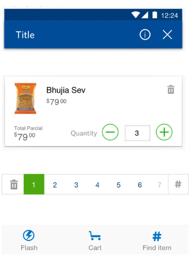
UI elements

Sam's Club diamond logo
Scan & Go
UI element sheet: a blue app bar with a Title and info and close icons, a product row for Bhujia Sev at $79 with a quantity stepper, and a numbered pagination strip
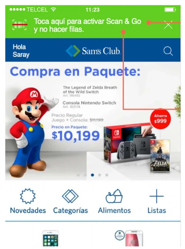
The live Sam's Club Mexico app home screen with a green Scan & Go activation banner annotated in red, a Compra en Paquete promotion and the bottom navigation

Usability testing

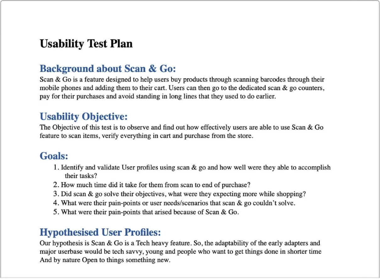
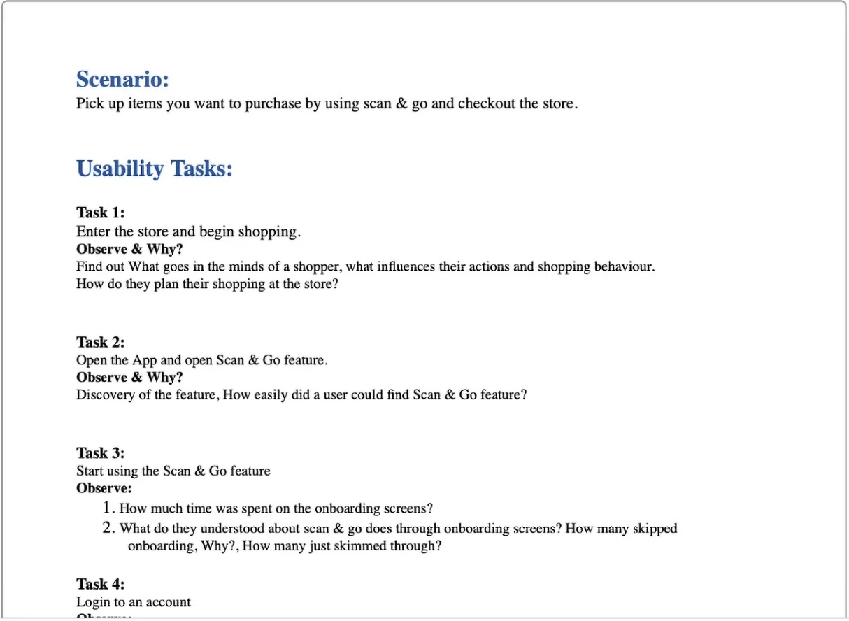
A usability plan was build, goals set and user profiles selected to conduct those tests. The idea was to test hypothesis on usability bahavior and revalidate that the final experience would endure the intended emotions, tasks are easy done and user delight was the center of everything.

Page one of the usability test plan: background on Scan & Go, the usability objective, five goals covering profile validation, time from scan to purchase and pain points, and the hypothesised early-adopter user profiles
Page two of the usability test plan: the shopping scenario, then numbered tasks — enter the store and begin shopping, open the Scan & Go feature, start using it, and log in to an account — each with its own observe-and-why prompts

THANK YOU